Choosing The Right Paint Colour
Pop, sizzle, and calm are this year’s secrets to décor colour choices.
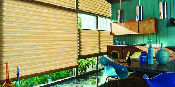
“My favourite way to change the look of a room,” says Sally Morse, director of creative services for Hunter Douglas, a leading window treatment company, “is of course, to do something fresh at the windows. But my second favourite way is to paint the walls a new colour and then accent it with complementary hues in different ways throughout the room.”
That inviting idea may take more guidance that it sounds.
“The only trouble,” Morse continues, “is that with dozens of variations of white alone and thousands of every other colour under the sun, it can be a daunting task to find the right ones, even for me.” To help solve the mystery, she has devised four ways to conduct the search and shares them with you here:
Four Colour-Right Methods
- Look at your wardrobe: Mostly blue…or green…or pink? Great, that’s your go-to colour. If you wear a dazzling variety of hues, there is probably one that stands out, maybe a jewel tone, primary bright or pastel. If black, beige or white is most prominent, consider your shoes, hats, jewellery and scarves to find the shades you lean toward. Any of them, or lighter or darker versions, are good possibilities for the walls or as accents to a white-and-black decorating scheme or one composed of neutrals.
- Look at nature: Do the soft tones of a beach in the summer – sand, sea foam green, blue sky and whitecaps – capture your fancy? Or perhaps autumn’s rusts, browns, oranges and golds. Maybe it’s winter’s icy blues, silver, stark white and slate gray skies. Or spring with its blossoming of green, pink and buttery yellows. One of these could dominate your décor; its opposite could play a supporting role along with two others.
- Look at a favourite rug, fabric, dish or a painting: Be they contemporary or antique, note the colours that sing to you, that drew you to them in the first place. Ask yourself if it’s light overall or dark, which colours stand out and which recede. Pick one of them for the walls (remember that all colours appear more intense as the area of coverage becomes larger) and contrasting or complementary hues as accents. A colour wheel can be useful here.
- Find photos of rooms you love in a magazine or online. This is excellent for those of us who simply can’t figure out what we like or who like certain colours in a room setting, but wouldn’t dream of wearing them. What counts is that they make us feel good. Be sure to note the combination of colours used to determine the secondary hues that will work best.
Don’t do this
Morse adds these important tips:
- Don’t be scared. The larger the room, the more depth the wall colour needs. Give it a go before you say “no”.
- Don’t assume it’s mandatory to paint baseboards and trim white. The newest style is no baseboards or a smooth swath of one colour from ceiling to floor. This is not only on- trend, but it makes the ceiling feel higher.
- Don’t forget the ceilings. A soft rendition above you of the wall colours can dramatically change the entire room.
- Don’t choose wall colours that are too pale. When selecting the primary colour for an open-style home, choose a slightly darker one than you would for a small room.
- Don’t forget the window treatments. With windows being such a prominent feature in any room,” counsels Morse, “it’s important to figure out the best way to dress them. They can either match the walls, which creates a calm, uninterrupted flow of colour that keeps the eye moving around the room or contrast with the walls which brings attention to them, and can make the room feel more intimate and cozy.
No matter whether it’s for window treatments, walls or furnishings, pick those colours that truly reflect you, and your home will be a haven of peace and harmony, the place you love to be.
Source: Homeservice Club